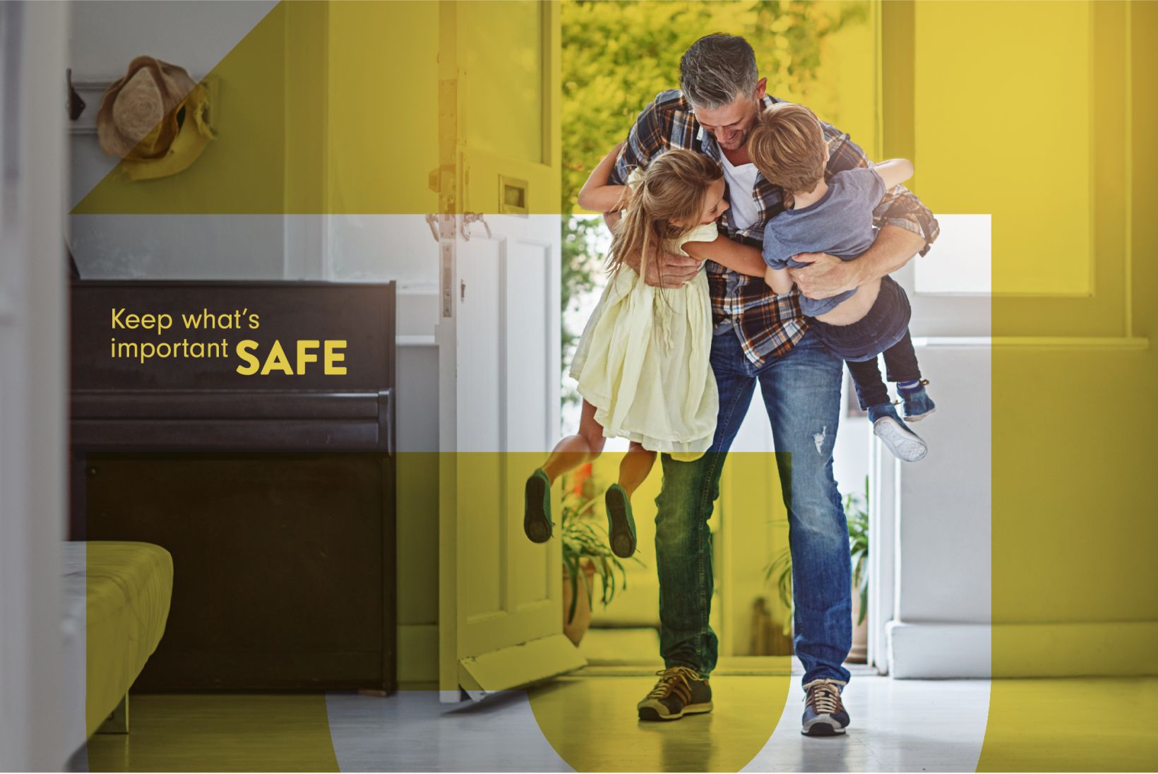
As third-generation locksmith experts, J & J Access & Security needed to balance decades of experience building and repairing locks with knowledge about new and emerging security technologies. The J & J team was ready for a new look and feel to represent the security and services they provide to families, property owners and business owners.
J & J approached TAG to help them solidify who they are and what their brand is. Their brand needed to be created around three central attributes of the company; trust, commitment and value. They wanted to be able to develop and expand their client base through a new website and communications and marketing plan.
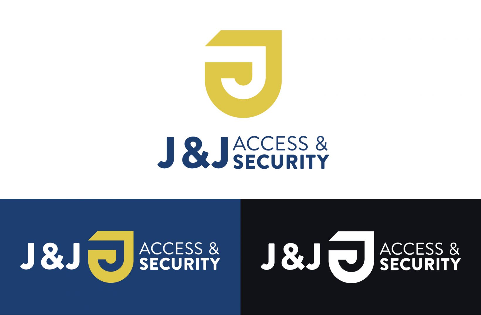
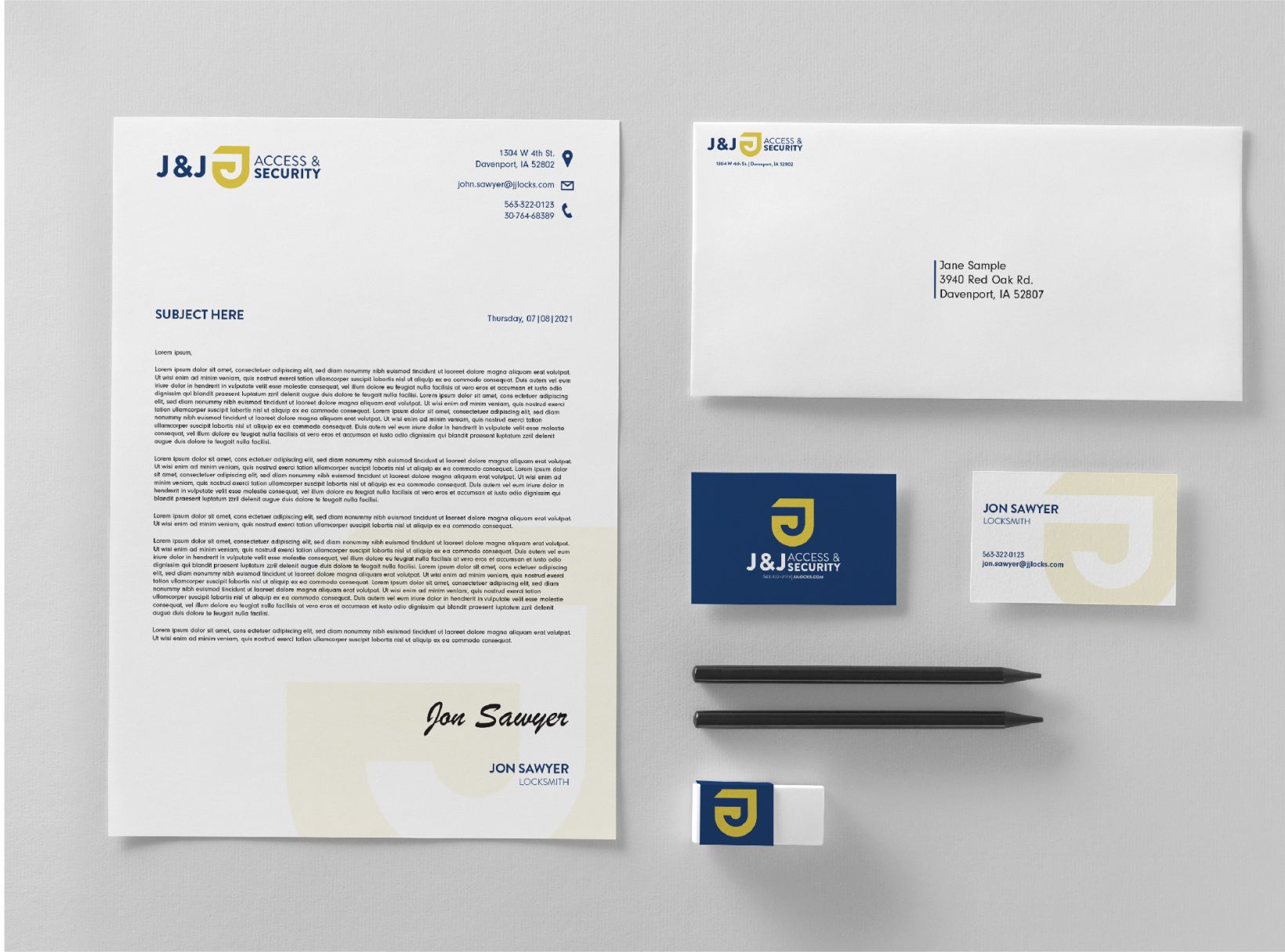
The logo became the epicenter of the new J & J Access & Security brand. The logo design features a lock shape to create two concentric J forms, conveying the intertwined relationship between the J & J team and their craft. The colors, chosen from the gold color of keys and locks, also represent the "gold standard" quality of service provided by J & J Access & security. Those design principles transferred to a website that’s optimized for keywords and ADA compliance. TAG designers also developed letterhead, business cards, envelopes and service van wraps to accompany their new look.
J & J has experienced elevated brand awareness since the launch of their new look. The newly designed service vans have caught many people’s attention throughout the Quad Cities. J & J now has a modern fresh appearance that reflects their standards of trust, commitment and value. TAG continues to partner with J & J for social media, blogging and PROmanagement.